
Hello! I’m Mazz, a designer and educator
I currently teach game development and 3D modeling, translating complex ideas into clear, engaging visuals. I’m now pursuing a full-time design role to apply my problem-solving and visual communication skills directly within a creative studio.
Ru by Kim Thúy
2026 - BOOK DESIGN
Mes sympathies
by Laurence Hélie
2026 - CD PACKAGING DESIGN
Havre du Ruisseau
2026 - LABEL DESIGN
Digital Creative Arts Centre (DCAC)
2025 - WEBSITE DESIGN
The Addams Family for the Grand Theatre
2025 - POSTER DESIGN
ZIMA
2024 - BRAND ADVERTISEMENT
KAVORKA
2024 - BRAND ADVERTISEMENT
Totally Spies!
2024 - TITLE SEQUENCE
Thanks for dropping by!
Whether you’re here out of curiosity or with a project in mind, I hope something resonated. Let’s keep the conversation going.
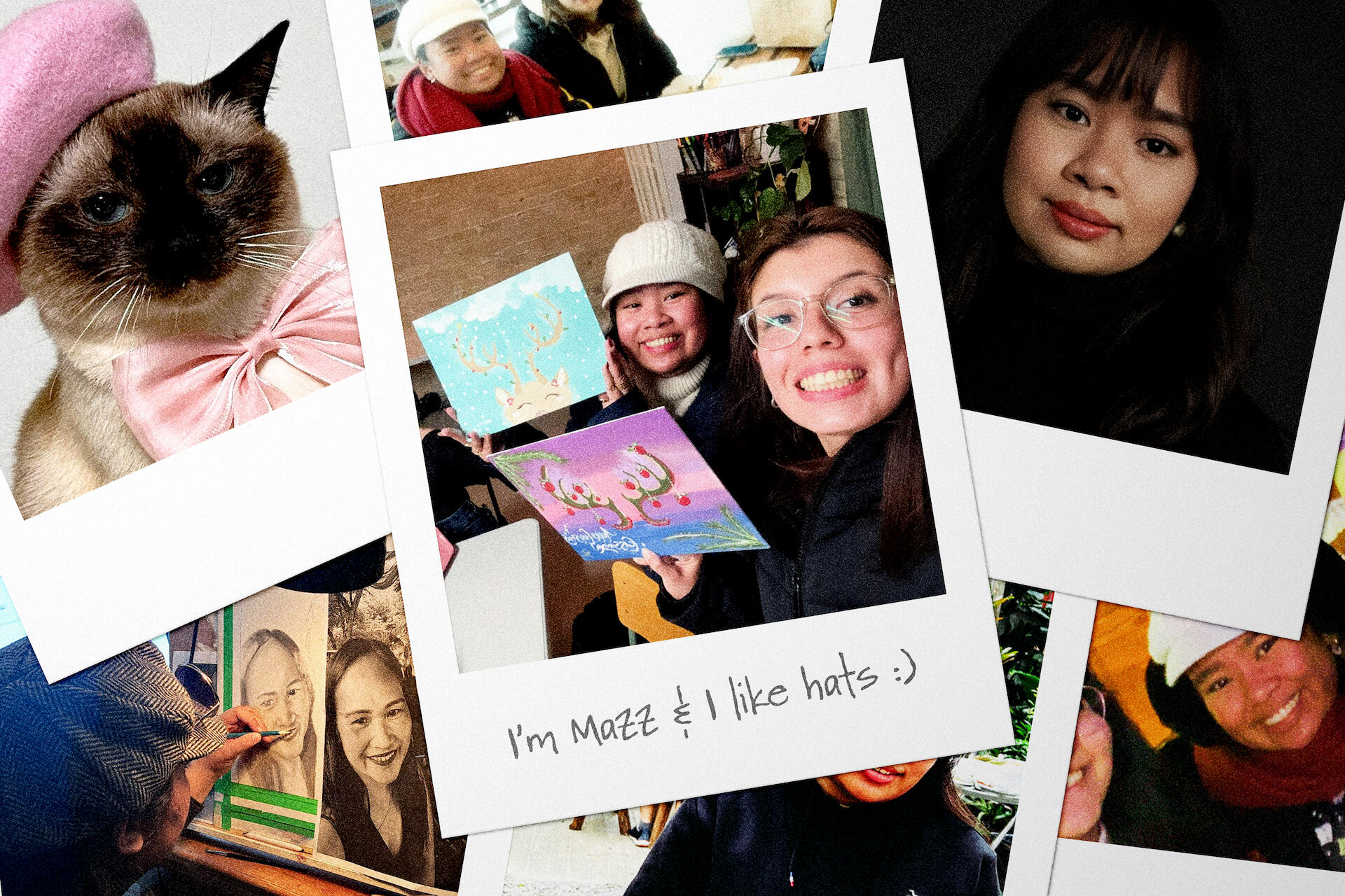
Hello again! Mazz here (.❛ ᴗ ❛.)
I’m a multidisciplinary designer with a soft spot for storytelling. I design across branding, packaging, web, and motion, but no matter the medium, I’m always chasing tone. Whether it’s a conceptual rebrand, a speculative title sequence, or a quiet book cover, I’m drawn to work that feels intentional, cinematic, and human.I recently graduated with a diploma in Interactive Media Design, where I built a portfolio that explores everything from nostalgic revivals to fictional luxury. I like projects that leave space for curiosity whilst also bringing a bit of emotion with them.Currently open to junior design roles, internships, or creative collaborations.Let’s make something meaningful.
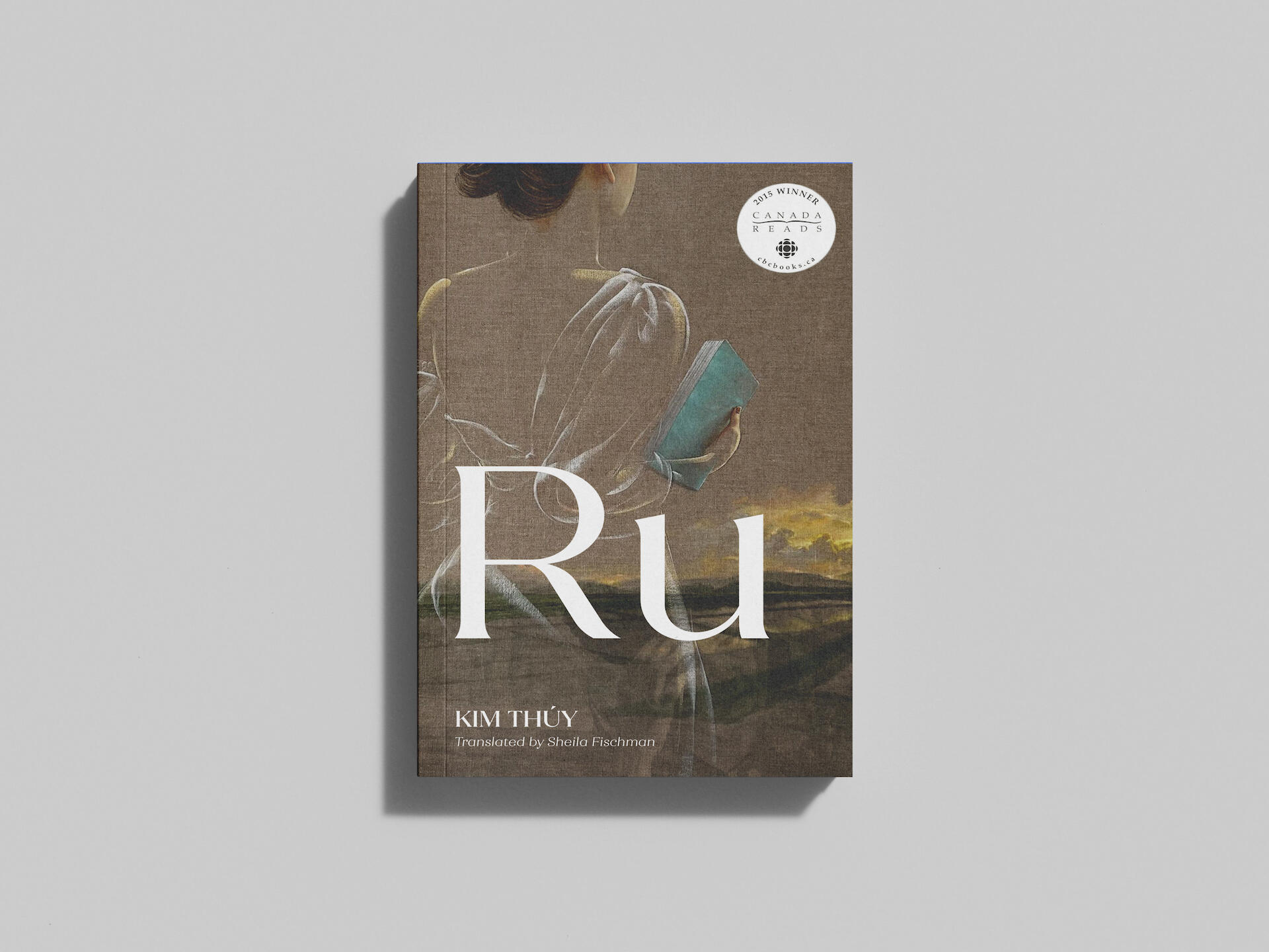
Ru by Kim Thúy
2026 - BOOK DESIGN
The Challenge
Design a literary fiction cover for the novel Ru by Vietnamese-born Canadian writer Kim Thúy that communicates the novel’s delicate, poetic exploration of displacement, memory, and cultural identity, without relying on cliché or overt symbolism.
The Process
— Researched Southeast Asian artists to find visuals that paralleled the novel’s emotional and cultural tone— Selected two paintings by Vietnamese artist Nguyen Minh Nam, whose “transparent” works explore the conflict between tradition and modernity, thus echoing the novel’s central tension. Works used include NHÌN VỀ CỐ HƯƠNG (sơn dầu), and The Sun Was Up, (oil on canvas)
Artwork credit: Nguyen Minh Nam— Paired the combined artwork with refined serif typography and a muted layout to maintain quiet elegance and clarity
The Solution
A visually restrained, concept-driven cover that mirrors Ru’s layered narrative. The paintings and typography work together to evoke loss, identity, and the fragility of memory, without overpowering the story’s voice.
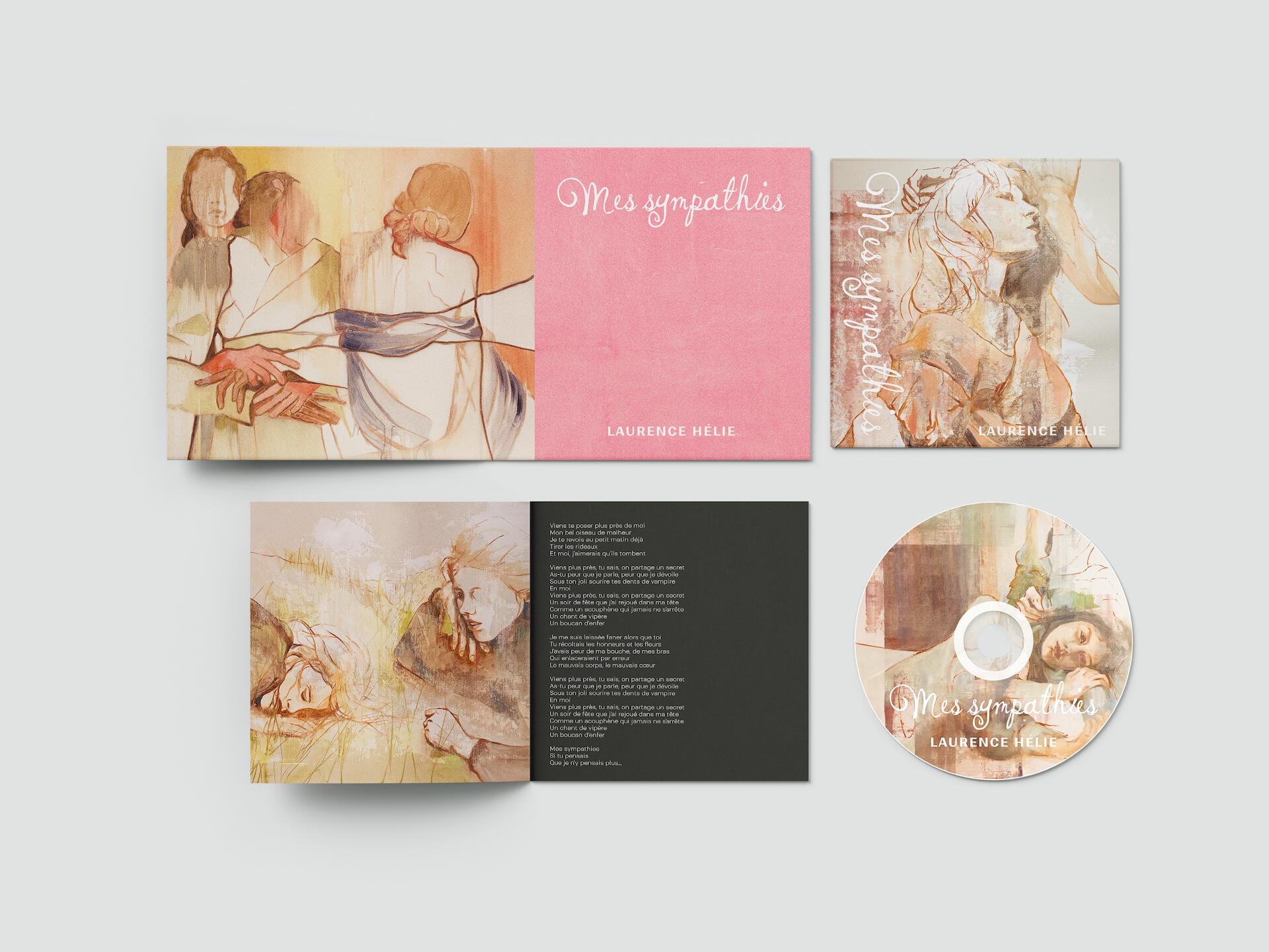
Mes sympathies by Laurence Hélie
2026 - CD PACKAGING DESIGN
The Challenge
Design a CD package that visually expresses the emotional narrative of Mes sympathies, a song about betrayal, reflection, and emotional healing.
The Process
— Selected paintings by French visual artist Sandrine Dickel, whose work explores human fragility and femininity, aligning with the song’s emotional core. Works used include Solace (2021, oil on Mylar), Pause (2022, from the Dancers series, oil on paper), Last Summer: A Little Nap in the Grass – Interlude (2021, oil on canvas), and Pastoral (2022, oil on paper)
Artwork credit: Sandrine Dickel— Interpreted lyrics and an interview with the artist to guide visual storytelling
Source: PAN M 360 — Laurence Hélie Has Found Her Name
Excerpt:
“I’m talking to someone who hurt me. And it took me years to understand what had happened. And writing this text allowed me to heal my wounds. To move on.” — Laurence Hélie— Paired the artwork with expressive typography and warm tones to reflect vulnerability and softness
The Solution
A cohesive, emotionally resonant CD package that mirrors the artist’s healing journey. The visuals and type work together to express softness, strength, and self-reclamation.
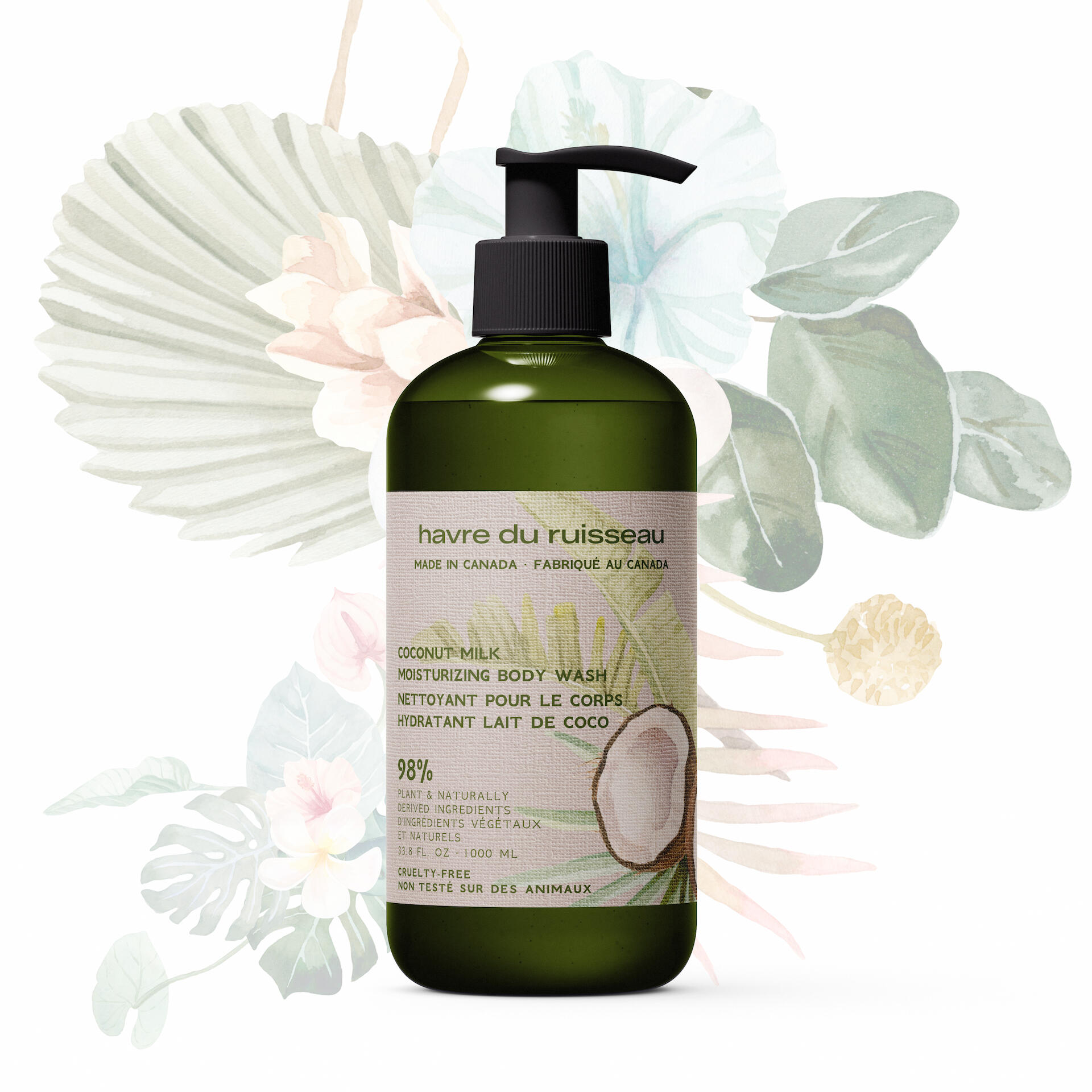
Havre du Ruisseau
2026 - LABEL DESIGN
The Challenge
Design a clean, bilingual label for a fictional Canadian body care brand that communicates purity, plant-based ingredients, and artisanal care without feeling clinical or rustic.
The Process
— Developed the brand name Havre du Ruisseau (“Haven of the Stream”) to evoke calm, natural Canadian landscapes— Designed a minimal, soft-toned label with hand-illustrated elements to signal gentleness and ingredient clarity— Prioritized bilingual legibility and hierarchy to reflect real-world Canadian packaging standards— Chose muted colors and a dark green bottle to reflect eco-conscious, small-batch aesthetics
The Solution
A simple, elegant body wash label that feels trustworthy, local, and naturally luxurious; blending handcrafted illustration with a clean, contemporary layout.
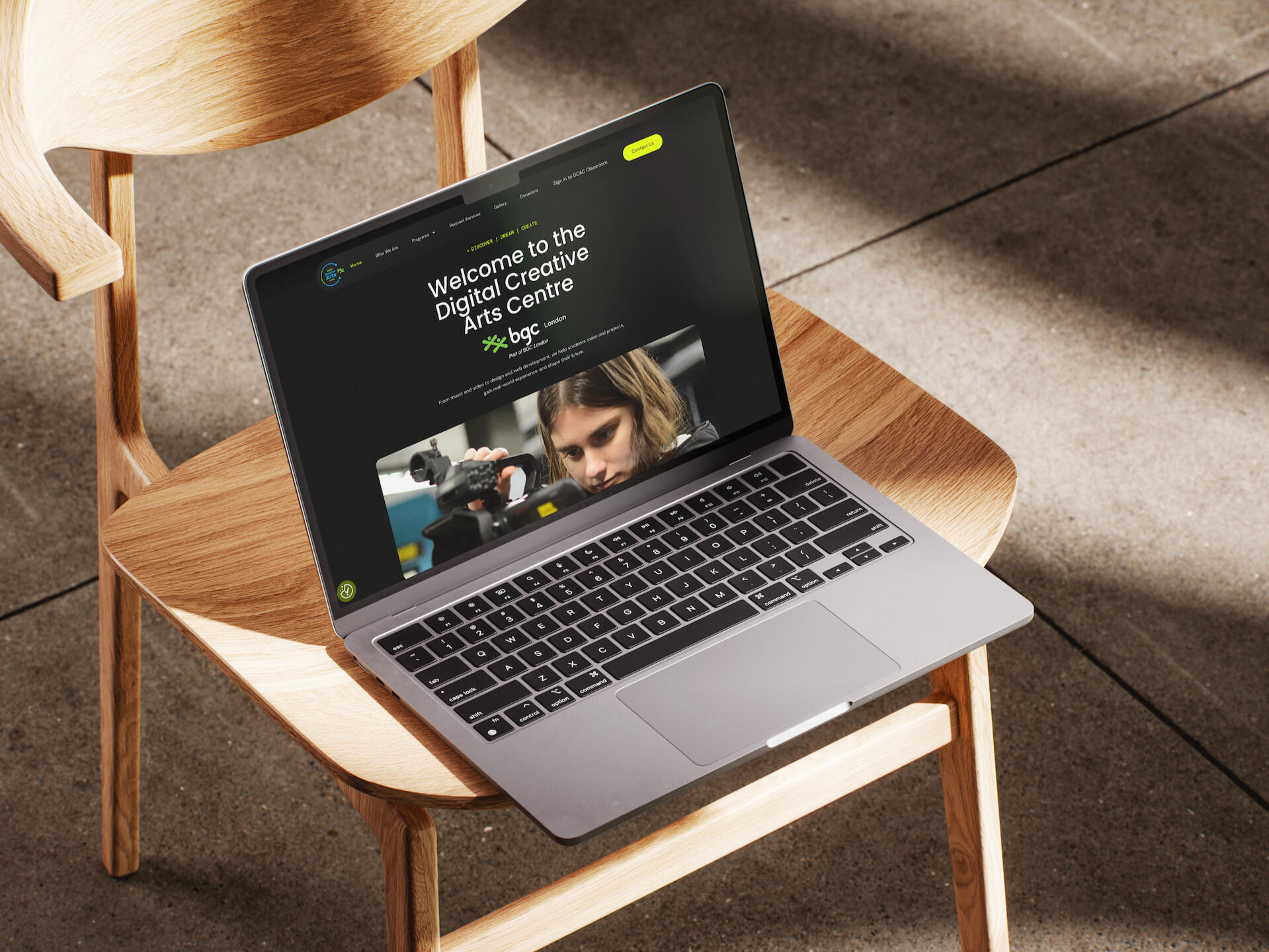
Digital Creative Arts Centre (DCAC)
2025 - WEB DESIGN
Live website: DCAC London
The Challenge
Redesign the website for a non-profit creative youth program to better communicate its mission, programs, and opportunities, while making the site more accessible, engaging, and aligned with its purpose: turning curiosity into creative careers.
The Process
— Audited the original site DCAC London and identified gaps in layout hierarchy, messaging clarity, and visual engagement— Clarified DCAC’s value proposition by highlighting key offerings: mentorship, SHSM workshops, co-op placements, studio access for students, and boutique video production services for the local community— Developed a more intuitive page structure to prioritize youth engagement, parent confidence, and partner visibility— Introduced bold visuals, clear CTAs, and an energetic but trustworthy design language to better reflect the creative mission
The Solution
A clean, welcoming, and accessible website that inspires youth, reassures parents, and supports DCAC’s mission. The redesign puts clarity, community, and creative potential front and center, thus helping users quickly understand what DCAC offers and how to get involved.
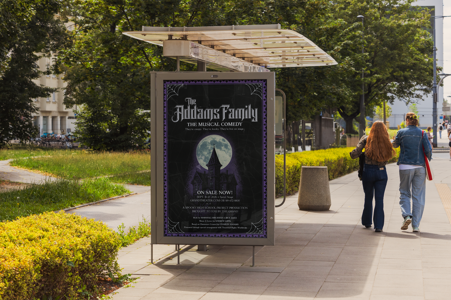
The Addams Family for the Grand Theatre
2025 - POSTER DESIGN
The Challenge
Design a theatrical poster for The Addams Family: The Musical Comedy that captures the show’s spooky charm and offbeat humor, while staying consistent with the Grand Theatre’s branding and production standards.
The Process
— Researched key visual themes from past Addams Family productions (Broadway, high school, and local)— Designed a moody central composition featuring a gothic mansion and oversized full moon to instantly signal genre— Integrated spiderweb borders and a textured background for tone, while using a purple-black color scheme that aligns with Addams Family lore— Applied hierarchy and clear type to ensure venue info, dates, and ticketing were readable in public environments (e.g., posters, bus shelters)
The Solution
A high-impact theatrical poster that blends playful horror with clarity and polish. Though originally created for a job application, the final design holds up as a standalone portfolio piece: showcasing storytelling, brand awareness, and theatrical flair.
ZIMA
2024 - BRAND ADVERTISEMENT
The Challenge
Revive ZIMA, a clear alcoholic drink from the ’80s, and reposition it for a modern audience. The goal was to create a conceptual brand ad that reintroduces ZIMA as a fresh, vibrant choice for women today.
The Process
— Researched ZIMA’s brand legacy and why it faded out— Identified cultural shifts and visual cues that appeal to modern female drinkers (wellness, nostalgia, minimalism)— Developed a concept around clarity, confidence, and coolness. Visually expressed it through clean visuals, soft light, and contemporary motion design— Used color, texture, and pacing to bridge retro roots with modern aesthetics
The Solution
A short-form brand ad that reframes ZIMA as bold, clean, and future-facing, thereby appealing to a new generation while nodding to its iconic past.
KAVORKA
2024 - BRAND ADVERTISEMENT
The Challenge
Create a high-end brand ad for a fictional Latvian skincare line that captures the sensuality and mystique of luxury skincare. The concept needs to feel elegant, instinctive, and emotionally charged.
The Process
— Developed a brand universe centered on intuition as ritual, blending natural elements with symbols of indulgence and radiance— Structured the ad’s pacing to mirror the music: starting soft and minimal, then building into a snappier, sensual rhythm— Used rich lighting, close-ups, and layered textures to convey intimacy, confidence, and opulence— Anchored the narrative with the tagline “Trust Your Intuition”, evolving from a gentle whisper into a statement of power
The Solution
A conceptual ad that positions KAVORKA as a radiant force in luxury skincare. It is a brand that doesn’t chase trends, but invites you to return to instinct, elegance, and the glow within.
Totally Spies!
2024 - TITLE SEQUENCE
The Challenge
Reimagine the animated series Totally Spies! as a live-action reboot, creating a conceptual title sequence that introduces the world, tone, and trio dynamic without using animation or dialogue.
The Process
— Sourced and edited B-roll footage to create a cohesive visual narrative inspired by the original series’ spy-action-glam vibe— Focused on fashion, movement, and location to establish character archetypes and covert-ops energy— Used fast cuts, layered texture, and color-grading to inject early-2000s camp with a modern, cinematic feel
The Solution
A stylized, high-energy conceptual opener that repositions Totally Spies! for a modern reboot, blending teen drama, spy thriller aesthetics, and Y2K flair into a tight, cinematic sequence that feels ready for streaming.